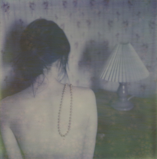
For christmas last year Leo gave me three packs of the impossible project's px-70 color shade film (polaroid), but I haven't had a chance to try it out until today. This is what the first test shot looked like about 7 hours after it was taken. So far I'm thinking that it needs to be pushed and heated much more to gain more colour/tones. Looking at this in real life almost looks like a monochrome photograph, but once I scanned it just now the scanner seemed to find more pink, purple and slightly golden tones that I really can't see when holding the polaroid in my hand. It is nice to have new film to experiment with, nevertheless.


I have had the same problem. I took just 2 frames and then decided to leave it until I'll find an idea what to do. Heating it up might be a good option
ReplyDeletekat: heating it up should give more colours according to impossible. I think I will put my future shots in the oven or on a really hot radiator to see what happens.
ReplyDeletegood to know that others also have problems with these new films.. but the picture is nice though.
ReplyDeletereally love this, regardless. :)
ReplyDeleteSå fint!
ReplyDeleteI like this quite a bit though. Soft and kind of sensual...
ReplyDeletethe new PX680 film from the impossible project is looking amazing. i think you'll really enjoy it . personally can't wait to try it!
ReplyDeleteI have tried using the same film and had the same problems.
ReplyDeleteBut I think that the violet/pink colours in this picture look really awesome. I like it a lot.
fantastique!
ReplyDeleteMagic!
ReplyDeletebeautiful. such calming tones.
ReplyDeleteI love your Pictures.
ReplyDeleteVery inspiring!
www.miliafly.blogspot.com
Beautiful!
ReplyDeletei like the dark tone in it. i'm excited for the ones coming up.
ReplyDeleteHej! Ursäkta men kan du hjälpa mig om hur man ger den dära separator/ tiden som du har längst upp på bloggenn! Snälla behöver verkligen en sånt hjälp!!
ReplyDeletethat´s interesting to see because last time i went to vienna i bought 2 packs of these new film, but i haven´t used them yet. i´m curious about the results..but I´m "scared" too of getting a monochrome picture..nevertheless I like the soft tones of your polaroid, thanks to your scanner ;)
ReplyDeleteI think the key to getting good results with this film is to leave the polaroid just lying around for a few weeks. I looked at this again not long ago, and it looks completely different. so many new colours seem to have surfaced.
ReplyDeletefernanda: it surely looks amazing, I can't wait to try it out either!
minh: hej! och nu blev det ett väldigt sent svar, ber om ursäkt för det! om jag förstår dig rätt så menar du linjen som finns under varje datumstämpel? det du behöver göra isåfall är att lägga till en "border-bottom" för dina datumheadings i htmlmallen för din blogg. jag vet inte hur det fungerar med blogg.se eftersom mallarna troligtivs är uppbyggda på olika sätt, men koden jag använde ser ut såhär i sitt sammanhang:
h2.date-header {
margin:1.5em 0.5em;
border-bottom: 1px solid #666666;
}
kan absolut inte lova att det fungerar, men du får prova dig fram!
daniela: I'm kind of scared of that too, but now when I've had this picture around for a while I can really see how it has changed (to the better) :)