A diptych from February last year. I've updated my website a little bit, or I actually had a whole new design planned at first. I just don't have any patience to work with frames (even reading several guides confuses me), so I settled for making a slight change to my old design instead. Feel free to stop by and tell me if something looks odd, missing photos, misplaced buttons etc. Also, if you are using an older version of your browser, the horizontal scrollbar at the bottom may not be visible. If you know of a way to fix this, please let me know!
I just visited your website & love what you did to the place. Very clean. Pretty, too. & I really dig the buttons. My browser obviously needs to be updated because the horizontal scrollbar was not visible. Everything else was fine.
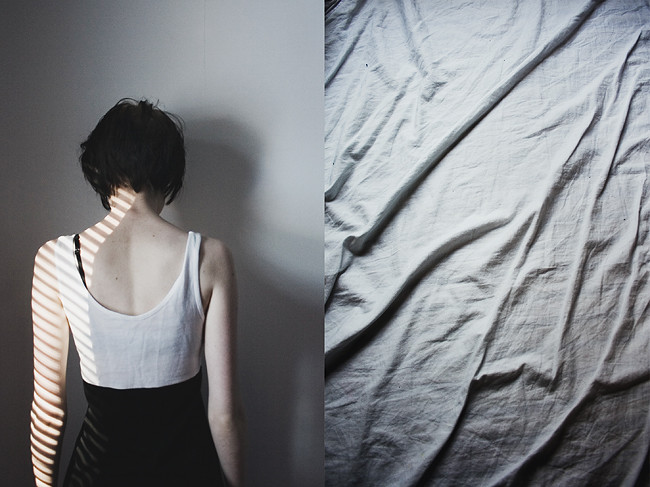
ReplyDeleteYour website looks great. I like the buttons on the bottom of the page and the pictures are so neatly organized.
ReplyDeleteI have been following you for a year now, i really admire your work, the passion and feelings that comes through your lenses, you've got sensibility...it's weird, i feel like we have met without meeting...
ReplyDeleteyour webside is great. Lovely pictures! :]
ReplyDeletegood, I'm glad it looks ok! it might look a little bit weird on smaller screens as well (I noticed it now as I am using a really shitty one at the moment), so I should probably make some more changes.
ReplyDeletebianca: I'm looking into the scrollbar thing, but no luck so far. you can still scroll though, but pressing down the wheel on the mouse and drag it to the right.
antoinette: thank you so much, you have no idea how happy that makes me! and I often get that feeling that I've met someone without having met them, don't really know what it is that triggers it :)
Lovely pictures! Can sit and look at your pictures over and over again! beautiful!
ReplyDeleteyour website looks great on my screen too :)
ReplyDeleteyour website looks great, i love your photos. :)
ReplyDeletei tried a lower resolution (1280*720) though, and the menu was hidden, i could only see the top one third of the circles. maybe you could a vertical scrollbar as well, although it could ruin some of the prettiness of the site. =/
or maybe you could put the whole content upper by making the space between your name and the photos smaller.
i'm into some html stuff and i'd be glad to help, contact me at welcometoentropia@hotmail.com if you wish. :)
jag tycker den är kanon! har själv hållit på ett bra tag att göra om min webbportfolio, men fan vad svårt det är att välja bilder..
ReplyDeletemarit: thank you so much :)
ReplyDeletegirts: good, I'm glad it does, and thank you!
alexandra: I noticed that too, at the moment I'm using a 1280x800 resolution, and it takes away a little of the circles (though not on the front page), so I'll see what I can do. decreasing the space between my name and the photos is probably a good idea :) my previous design had even bigger images, and I don't think I have any energy to resize them once again, at least not right now. thanks for your input, and if there's anything I would like help with I'll send you a message :)
johanna: tackar! det är verkligen otroligt svårt att välja bilder. det händer ofta att jag kommer över bilder som jag av någon anledning inte har med i portfolion och tänker 'dessa ska jag lägga till när jag uppdaterar nästa gång'. men när jag sen väl sitter där och planerar så hittar jag aldrig dem igen, haha.